NC State Performance Based Measurement
Computer Modeling & Animation
|
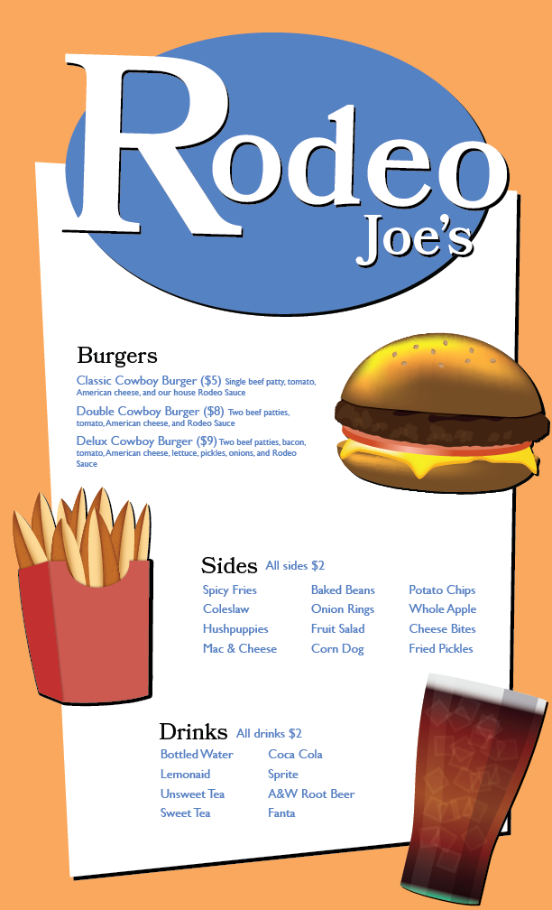
When working through the cheeseburger tutorial, I learned a number of techniques for realistic illustration including how to use the mesh tool to shade shapes (buns), how to use symbols to repeat small parts of a design (seeds), and how to use opacity to add texture/shading to an illustration (burger patty). I also experimented with some new tools on my own including stroke width (grill marks), gradient tool (tomato, drink, fries), and warp tool (cheese). For the overall design, I chose to put the name of the restaurant on top of the page so it is clearly visible but out of the way of important information. Below, each section was grouped off and given a corresponding illustration to further divide the sections and give the viewer a visible representation of what each section might be about. Other than the burger, I chose to make fries and a soda as they represent some of the most popular options from their corresponding menu sections. The fries were made by placing two seed shaped polygons next to each other and given a gradient color before being duplicated and placed in a box. The soda was made with one large gradient with overlaid ice cubes, a highlight, and a shadow. The overall colors in the design were blue and orange: complementary colors. The typefaces used were Bookmania, a serif font that captures the old-west aesthetic, and Gills Sans, a clean sans serif font that makes important information readable while still maintaining a slightly stylized look with its low x-height.
|
|
|
The storyboard opens up with a shot of the two kids eating lunch. The kid on the right is a bit more outgoing: shown by his trendier styling and modern lunch supplies. The kid on the left is a bit more reserved - demonstrated by his more traditional style and lunch. The beanie kid gets a notification as he's checking his phone, reminding him of the test. In line with his outgoing character, he overdramatically pops up and alerts his friend of the test. Beanie kid leads the way as the two of them rush to the testing location. Their old, stern teacher doesn't allow them in as they are a minute too late. The kids talk it out an decide to not worry about the past and the things they can't change in life.
|

|
|
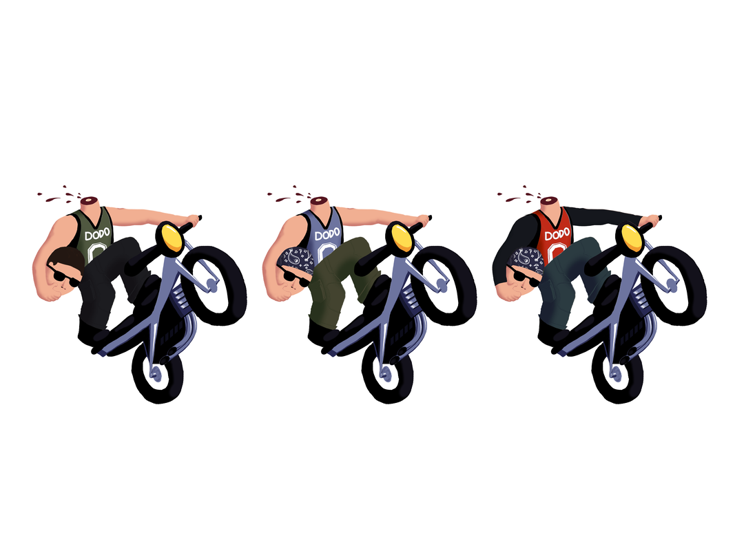
My rough character sketch depicts a decapitated motorcyclist, performing a wheelie on his bike. This character, the "Headless Biker," is a modern adaptation of Washington Irving's popular character, the "Headless Horseman." The Biker's apparel consists of jeans/cargo pants to protect him from falls as well as a basketball jersey to show his support for the local team. I would like to see this character adapted into a movie as a main antagonist. The protagonist would enter the Headless Biker's city only to be haunted by the Biker for the majority of the movie before he exposes the Biker's true identity (not actually a decapitated motorcyclist: just someone dressed up as the myth). It would be a Scooby-Doo type mystery movie. The Biker would show up mysteriously, mess up something the protagonist was doing, and then escape on his bike before he could be caught - until they catch him at the end of the movie.
|
|
|
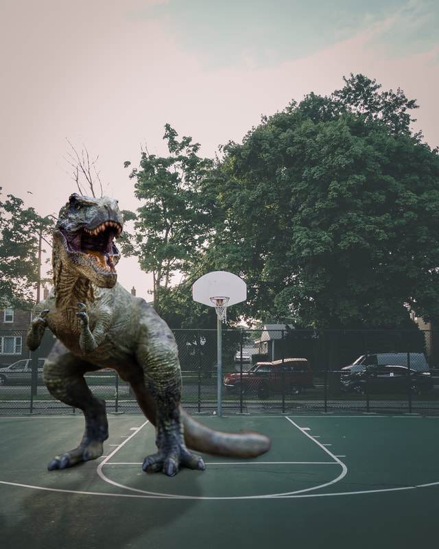
I began this project by thinking of an item that would look out of place logically but still fit into a scene cohesively. I settled on a dinosaur in a present day scene. I likes this project because it gave me good practice making realistic photo edits.
|
|
|
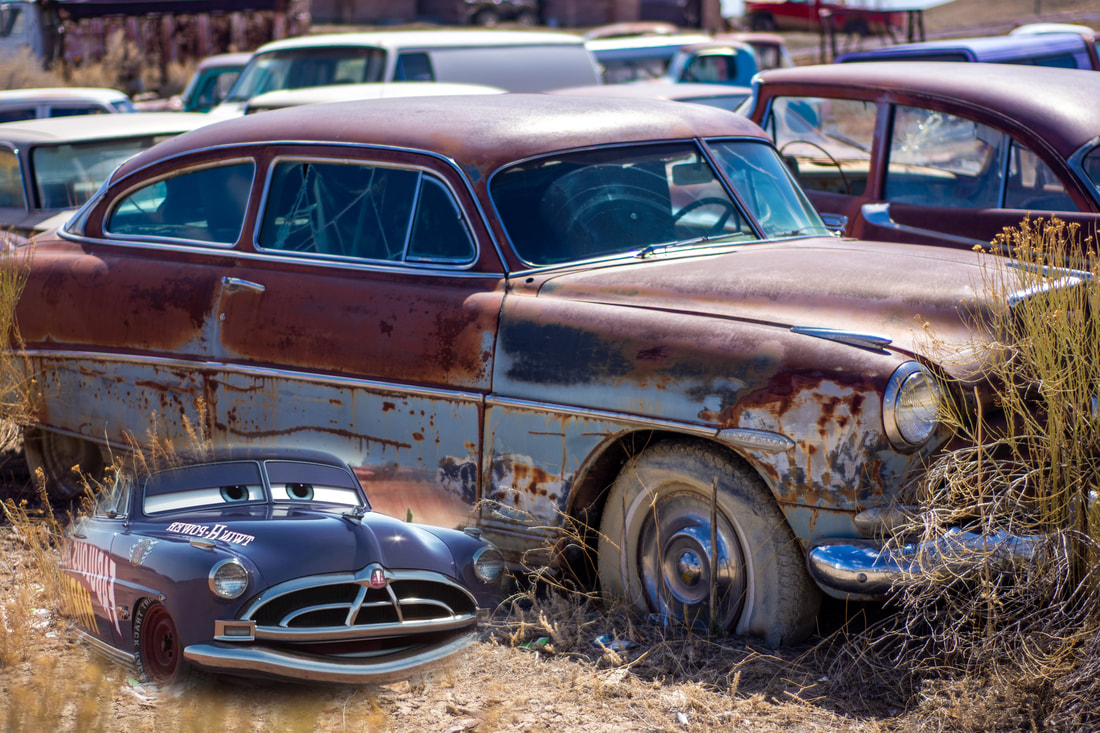
I began this project by coming up with a theme for my pictures to follow to create, in the words of the rubric, "an interesting, fun, and humorous graphic." I liked this project because it provided good practice learning a new skill that is useful in general Photoshopping. The easiest part of this project was actually creating the vignette for the graphic. The hardest part was coming up with something that was "interesting, fun, and humorous" without using copyrighted material; I ended up using one royalty free picture and one copyrighted picture. From past lessons, I used my knowledge of transformations to arrange the items in a cohesive way, and I used my knowledge of layer masks to make the vignette non-destructive. In the real world, I can use this lesson to combine graphics into a single design - perhaps for a t-shirt or collage. I learned how to adjust the "feather" of different selection tools in Phototshop to create a vignette around a selection. This lesson would have been better if there were less of a focus on being funny so I could have thought of something using only royalty free graphics.
|
|
|
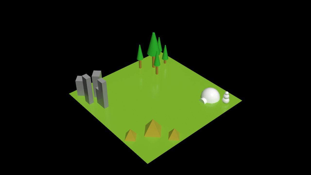
I began this project by watching the attached video to see how to complete the project. I liked that the project was very objective in what it wanted. The easiest part of the project was creating the skyscrapers because the rectangles were the simplest shapes to make. the hardest part was the trees because they took the most parts and parameter adjustments. From past lessons, I used my knowledge of creating privatives and using the modifier tab to create exact sized shapes. I can use what I learned in this lesson in the future to transport 3D scenes to others using the OBJ file format. This lesson would have been better if it introduced new 3D modeling techniques or provided a more challenging but less tedious task.
|
|
|
I began this project by reading the instructions fully so I would know what I needed to turn in and what my end result should be. I liked this project because the things we made (apart from the bolt) actually look really good. The easiest part of this project was the chess piece because it used the same lathe technique as the wine glass, but I already knew what I was doing by then. The hardest part was the screwdriver since it used the most complex and precise shapes. From past lessons, I used my knowledge of box creation and positioning/centering, as well as key frame animation and rendering. In future modeling assignments, I can use these lessons to make circularly symmetrical objects and to align shapes on a path. In this project, I learned how to use the boolean, lathe, and loft modifiers to make more complex shapes. This lesson would be better if the threads of the bolt were realistically continuous.
|
|
