|
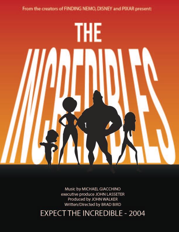
Movie Poster Project(Made in Illustrator) 3/28/24
I am proud of this project because I think it looks like it could be a real movie poster. In fact, I looked up Incredibles posters to make sure I wasn't plagiarizing; that's how clear of an image I had in my head of this design. The jpeg export messed up the design a bit (I should have used a png), but I like how the black superheroes stick out on the light background, and I like the subtle gradient I added to the ground to make their feet slightly visible and make it look like the words have a bit of bounce light on the ground. I got practice using pen tool tracing the heroes, the gradient tool making the backgrounds, and the envelope distort feature making the title. |
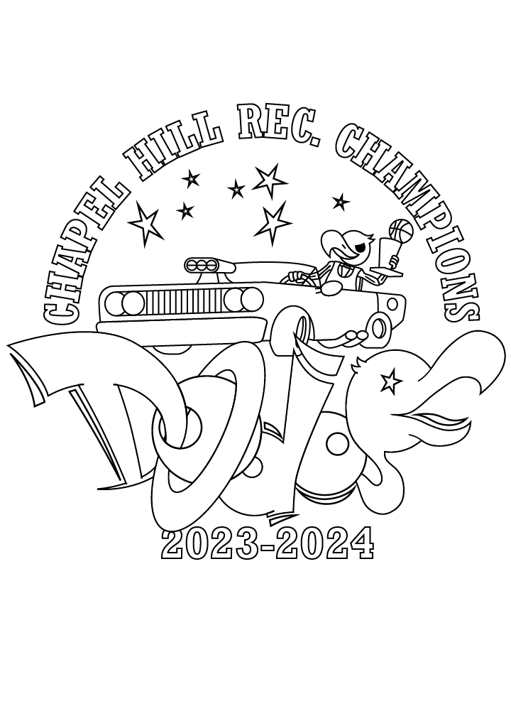
Dunking Dodos Championship Tee(Made in Illustrator) 3/28/24
This was an independent project that built on the Dodos City Logo I made last quarter. I again traced a pencil sketch (this time of a dodo driving a muscle car) and used it in the design for a championship tee shirt. I am particularly proud of this because I drew the car fully from memory (no references/tracing). There's nothing wrong with using references but it's still cool to draw from memory. I also like how my friend recommended I change what was a basketball in his hand to a trophy because it really improved the design. I got more practice using pen tool and shape builder tool with this design as well as the type on path tool. I plan/hope to screen print this design onto some shirts over break. |
|
|
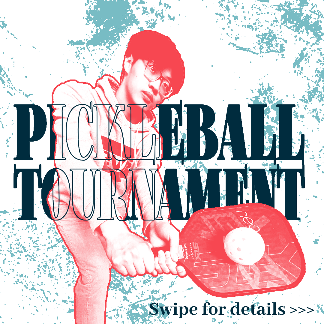
Pickelball Social Media Post(Made in Photoshop) 3/28/24
This was a personal project used to advertise a tournament that my friend and I are holding. I am proud of it because I went through numerous iterations to come up with the best design. I got to make use of many types of adjustment layers including threshold (for the noise in the background), gradient map (to turn Henry red), and curves (to raise the black point and lower white point to make him look more interesting/bold). I also took the picture and posed him for it. Lastly, I am proud of the depth I got by using the solid text behind him, the outline text in front of him, and the fully covered text behind the paddle. |
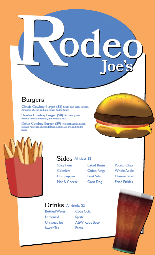
Cheeseburger in Paradise Menu(Made in Illustrator) 3/28/24
I am proud of this project because of its scale (3 separate detailed illustrations combined into one large composition), its functionality/real world application (looks like a real menu), and my pushing myself to use some new tools. For example, The slice of cheese was just a squashed square but I used the warp tool to curve the corners over like it was melting. I used the stroke thickness tool to quickly make some grill marks, and I used another tool (can't remember the name) to jitter up the burger to make it look more textured and realistic. I am also proud of being able to make two more menu items that stylistically fit with the burger which was a bit out of my comfort zone itself. I also got to use skills like color theory and logo designing on this project |
|
|
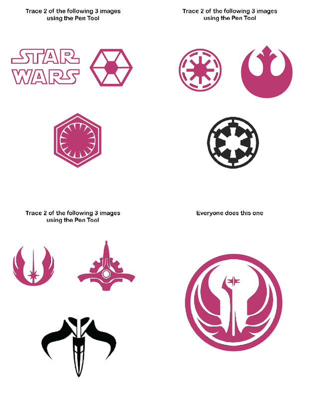
Pen Tool Practice(Made in Illustrator) 3/28/24
I am proud of this project because I think I did a really good job matching up my tracings up to the original shapes. I learned a lot about how to effectively use the pen tool, and it came back to help me on some of the later assignments including the Incredibles Movie Poster featured above. I used the pen tool as well as some transformations (rotation/reflection) to make these traces. |
Design Matrix Challenge(Made in Illustrator) 3/28/24
I am proud of this project because I had an idea for an effect to slice the text and make it different colors depending on the background. It ended up looking pretty good. I like how the overall gradient of the colors is from light to dark, and its cool how the maroon looks different on the white background vs. the black. I also like how I used every width of font to demonstrate all the characters, but I wish I hadn't tried to continue the effect from the background because the shear amount of sliced up colors just makes the top part look too busy. I achieved this effect with the shape builder tool after outlining the stroke of the text. I gained experience making designs with no images. This project was difficult because I originally couldn't think of what to do with it other than bring in an image for the background |
|
